-
Hi, I am the owner and main administrator of Styleforum. If you find the forum useful and fun, please help support it by buying through the posted links on the forum. Our main, very popular sales thread, where the latest and best sales are listed, are posted HERE
Purchases made through some of our links earns a commission for the forum and allows us to do the work of maintaining and improving it. Finally, thanks for being a part of this community. We realize that there are many choices today on the internet, and we have all of you to thank for making Styleforum the foremost destination for discussions of menswear. -
This site contains affiliate links for which Styleforum may be compensated.
-
STYLE. COMMUNITY. GREAT CLOTHING.
Bored of counting likes on social networks? At Styleforum, you’ll find rousing discussions that go beyond strings of emojis.
Click Here to join Styleforum's thousands of style enthusiasts today!
Styleforum is supported in part by commission earning affiliate links sitewide. Please support us by using them. You may learn more here.
Styleforum gets a fresh face - now live
- Thread starter j
- Start date
- Watchers 41
")
Classic Menswear Featured products
-
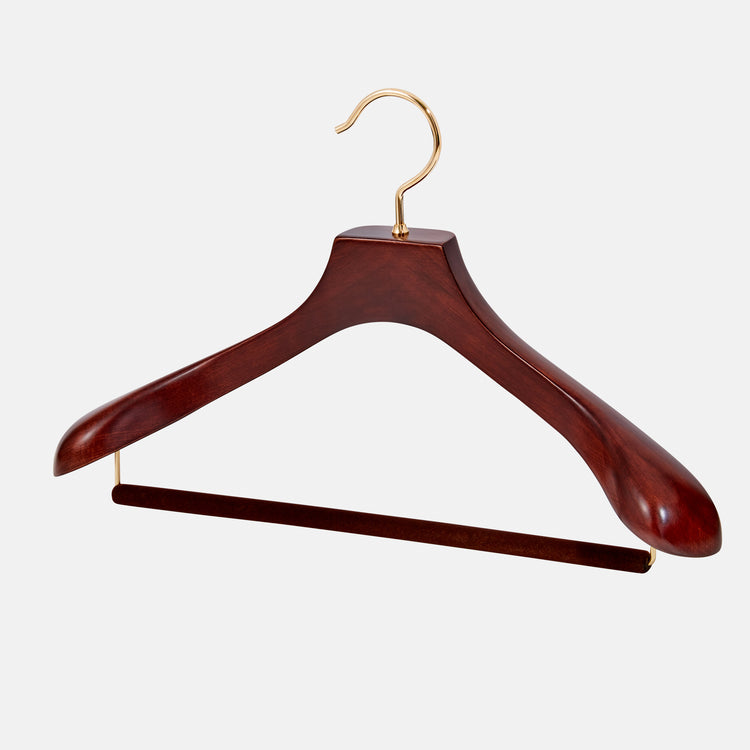 Arterton - Nakata Suit Hangers Set of 3 The hanger is single-jointed and composed of luxury European beechwood, which is bound to last a lifetime. Each hanger is woodwork-ed by hand in order to shape the neck and shoulders for fine suits, coats, and jackets.
The contours of this hanger preserve the integrity of garments, keeping them wrinkle-free and away from unnecessary fabric wear (e.g. shoulder dimples, stretching).
Arterton - Nakata Suit Hangers Set of 3 The hanger is single-jointed and composed of luxury European beechwood, which is bound to last a lifetime. Each hanger is woodwork-ed by hand in order to shape the neck and shoulders for fine suits, coats, and jackets.
The contours of this hanger preserve the integrity of garments, keeping them wrinkle-free and away from unnecessary fabric wear (e.g. shoulder dimples, stretching). -
 LuxeSwap Auction - Manolo Blahnik Brown Wholecut Leather Loafers One of several examples of fine footwear offered this week by LuxeSwap at a $9.99 opening bid, no reserve auction, an scarce example of a mens shoe by Manolo Blahnik is crafted on a last reminiscent of Gaziano & Girlings fabled TG73 last. A very fine pair in near mint condition.
 -
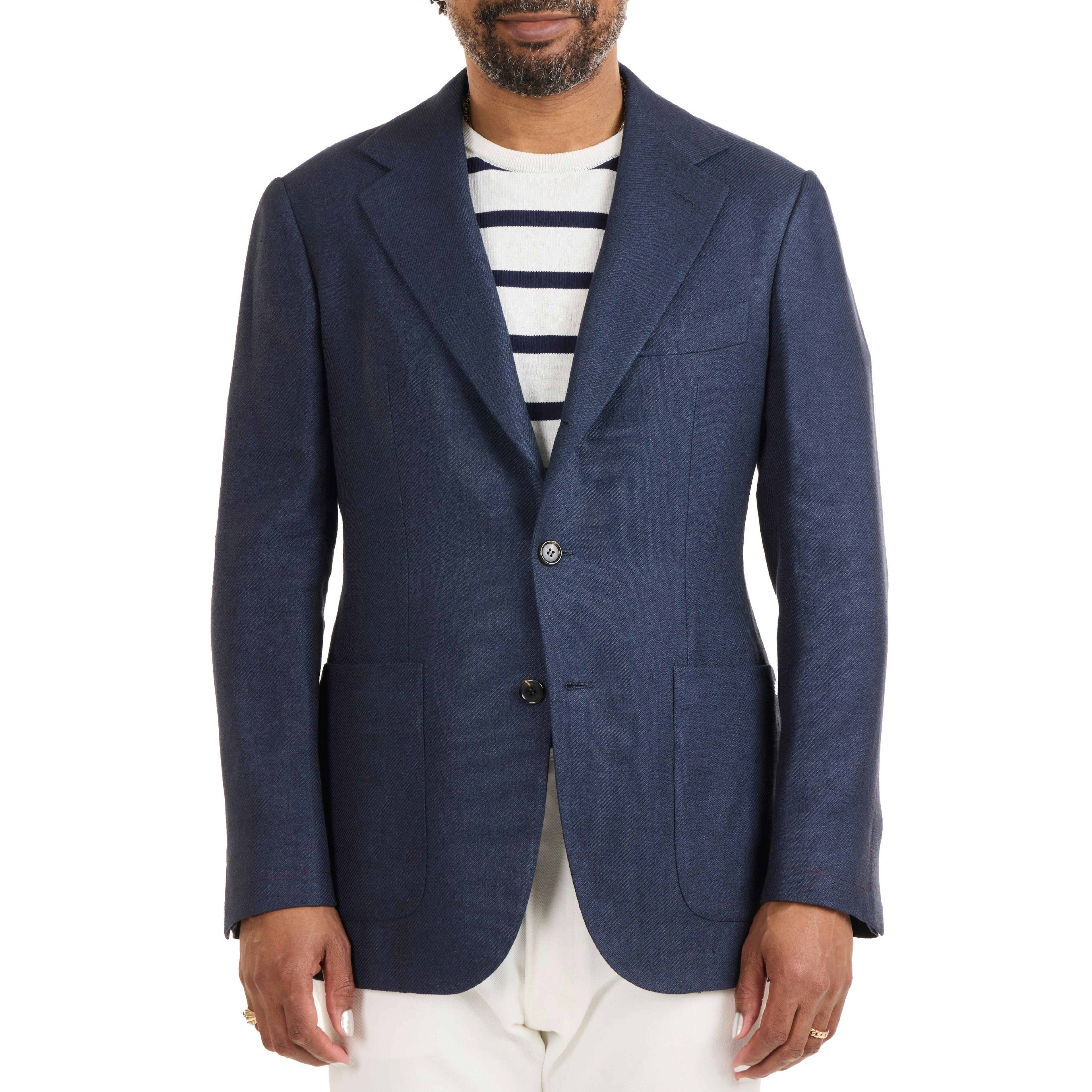 The Armoury - Linen/Silk/Cotton Twill Model 103 Sport Coat - $3,000 The Armoury’s Hundred Series is a handmade take on our house tailoring models. An evolution of our Model 3 jacket, The Model 103 is almost completely handmade, with all production happening in the center of Italy.