venessian
Distinguished Member
- Joined
- Jan 23, 2011
- Messages
- 3,204
- Reaction score
- 1,923
But that iteration to me is "6 of one/half-dozen of the other" vis a vis the original. The dials will yes be slightly (annoyingly so?) different sizes, which you and I and others might still accept (esp. if the PR dial was not on axis with the calendar dial but rather off-axis as a lot of other (Lange, RDM, etc) beautiful and coherent dials posted in the past few pages do).View attachment 1594196
i get the critique that the margin of the left subdial is misspent, here's another look with that margin reclaimed by the main dial which gets you a bigger bite of numbers, the asymmetry doesn't much bug me (even so on a dress watch!) as i think it develops a hierarchy along with the hands treatment
However, the visible portion of the 8 and 10 being larger than the visible portion of the 2 and 4 seems even more odd to me than the original layout, as it would then result in 3 different sizes (the 2 and 4 being cut in half, the 8 being barely whole, and the 10 basically 3/4) for the 4 numerals around the 2 sub-dials.
 Also, the tangents of the dials relative to center and chapter ring/bezel end up all over the place.
Here without my added red notations. I don't know...you may be right. It looks a little better than I thought, especially of course if the 10 was whole too.
Nonetheless I prefer the same size dials, with symmetrically cut 4 numerals, but...a non-starter for me either way because I would just not buy cut numerals, even printed ones. Especially because Dornbluth has beautiful (the same font and size) applied numerals, which I think are great and worth the upgrade, but look really sad when chopped.
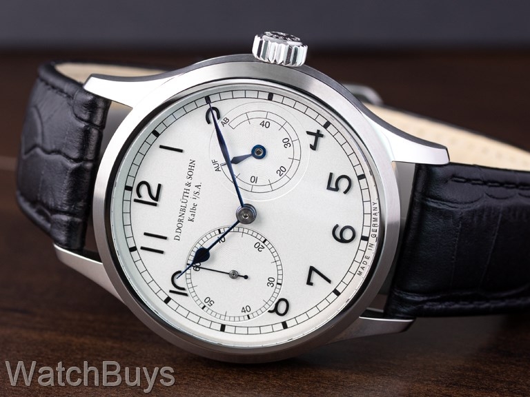
For me, they should have done the most simple thing, laid out 2 same-size circles, and moved on from there.
Last edited:

