timothylarson
Member
- Joined
- May 1, 2013
- Messages
- 6
- Reaction score
- 0
I am looking for advice on creating a luxury brand.
For years I have done woodworking as a hobby and have recently gotten into creating high end pens using exotic woods along with premium hardware.
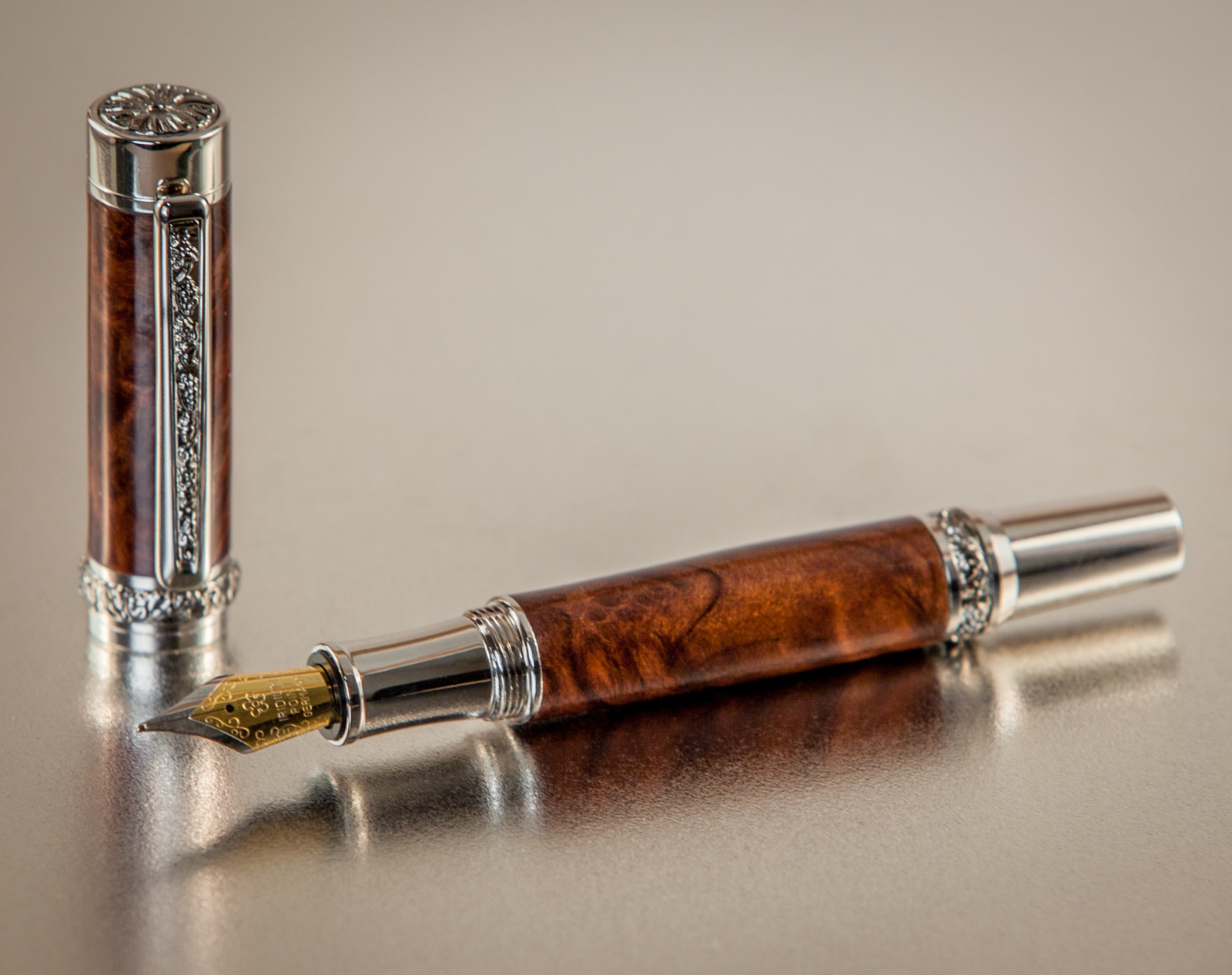
Here is a pen I created last week using a Redwood Burl with hardware plated in Rhodium and Black Titanium which makes it extremely corrosion and wear resistant.
I am at the point where I would like to launch a pen brand which would sell the luxury pens I handmake one at a time.
To do this, I want to get the brand right.
The brand name I have come up with is Sabre Pens, and I am currently working with a designer on a logo.
This is where I need some help.
Here are three designs with my thoughts about each. Let me know what you think:
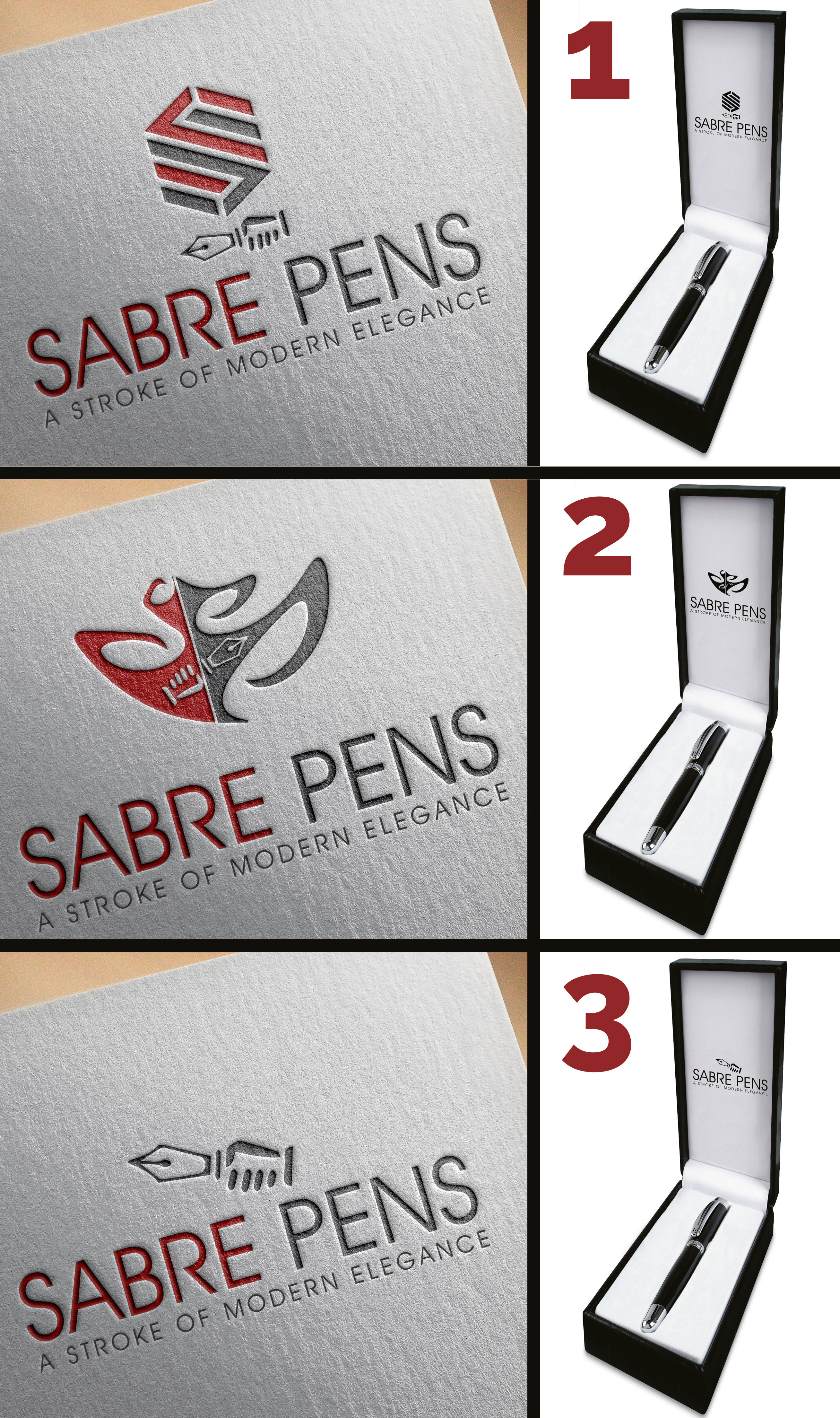
I like the idea of the hand holding the pen as a sabre but does it work?
The first design is an S for Sabre with the pen beneath... Is it too generic?
The second design makes me think of slaying a dragon... It has a certain flare I like, but is it too abstract or busy?
The third design is the cleanest, however, is this design too cartoonish for a luxury brand?
Let me know which logo, if any, you like the best and why.
Is there a clear winner, or should I go back to the drawing board?
Thank you for any advice you my have.
For years I have done woodworking as a hobby and have recently gotten into creating high end pens using exotic woods along with premium hardware.
Here is a pen I created last week using a Redwood Burl with hardware plated in Rhodium and Black Titanium which makes it extremely corrosion and wear resistant.
I am at the point where I would like to launch a pen brand which would sell the luxury pens I handmake one at a time.
To do this, I want to get the brand right.
The brand name I have come up with is Sabre Pens, and I am currently working with a designer on a logo.
This is where I need some help.
Here are three designs with my thoughts about each. Let me know what you think:
I like the idea of the hand holding the pen as a sabre but does it work?
The first design is an S for Sabre with the pen beneath... Is it too generic?
The second design makes me think of slaying a dragon... It has a certain flare I like, but is it too abstract or busy?
The third design is the cleanest, however, is this design too cartoonish for a luxury brand?
Let me know which logo, if any, you like the best and why.
Is there a clear winner, or should I go back to the drawing board?
Thank you for any advice you my have.