no one
Active Member
- Joined
- Jan 1, 2012
- Messages
- 36
- Reaction score
- 12
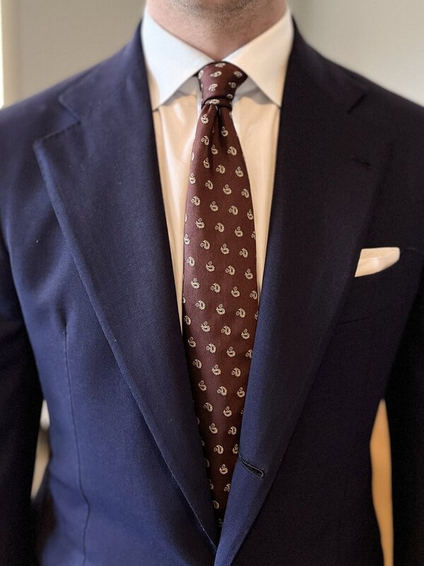
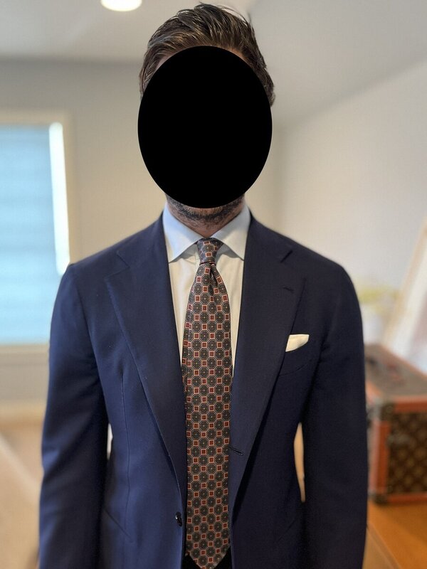
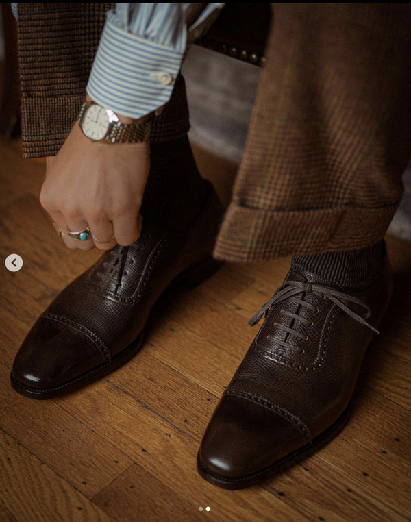
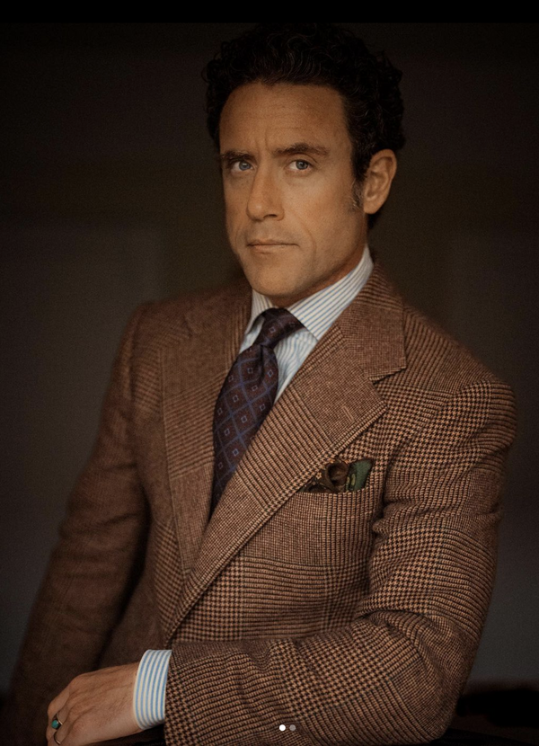
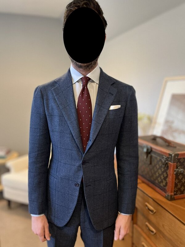
I appreciate your comments. The tie is actually burgundy and has a herringbone self pattern, something which is not apparent in the photograph. I am not certain this helps my case.no one - disregarding fit issues for a moment, this outfit is "ruined" by both the shirt collar and the tie. Same outfit with a white shirt (or a blue shirt) would undoubtedly be better, even with a striped shirt or a checked shirt... and with another tie even more so
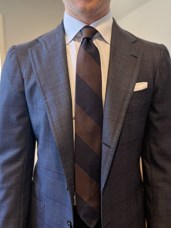
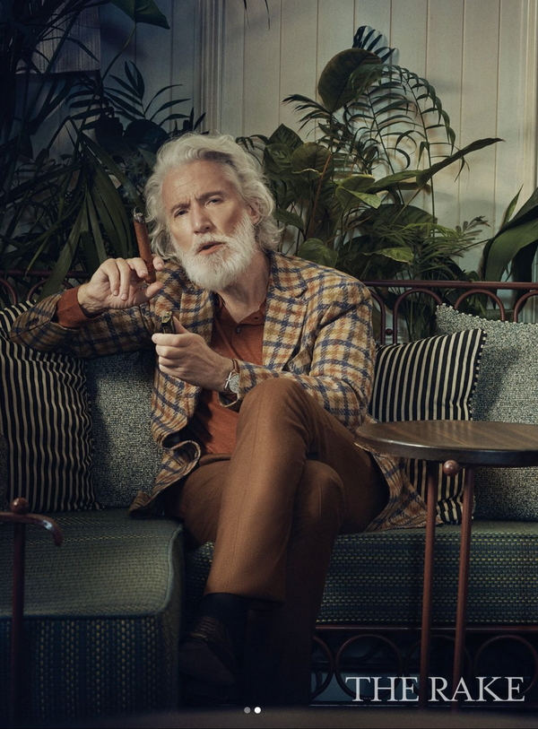
citan - can't get behind that chunky lilac windowpane. Is that a suit or sport coat?
I can tell from your posts that my taste (or lack thereof) regarding colour combinations differs drastically from yours. Perhaps I am beyond salvation in that respect. Having said that, I am extremely interested in hearing your comments regarding fit issues. I understand, however, that these are beyond the scope of this thread, which I will not derail any further.