• Hi, I am the owner and main administrator of Styleforum. If you find the forum useful and fun, please help support it by buying through the posted links on the forum. Our main, very popular sales thread, where the latest and best sales are listed, are posted HERE

    Purchases made through some of our links earns a commission for the forum and allows us to do the work of maintaining and improving it. Finally, thanks for being a part of this community. We realize that there are many choices today on the internet, and we have all of you to thank for making Styleforum the foremost destination for discussions of menswear.
  • This site contains affiliate links for which Styleforum may be compensated.
  • STYLE. COMMUNITY. GREAT CLOTHING.

    Bored of counting likes on social networks? At Styleforum, you’ll find rousing discussions that go beyond strings of emojis.

    Click Here to join Styleforum's thousands of style enthusiasts today!

    Styleforum is supported in part by commission earning affiliate links sitewide. Please support us by using them. You may learn more here.

Testudo_Aubreii

Senior Member
Joined
Apr 29, 2011
Messages
947
Reaction score
309

Agreed.  The shirt base seems to be an ecru color which doesn't go well with the yellow dots. I'm not crazy about the tie with the jacket either.  I think there's too much blue (which can definitely work sometimes). 


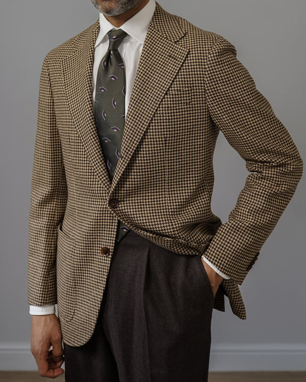
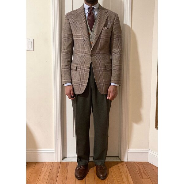
The ground of Clag's shirt looks white to me. I think Caustic nailed the disharmony: the scale of the shirt check matches the scale of the tie nubs. It's a bit disconcerting, but I think it looks fairly good, like a man who is playing around with a rule whose point he understands. It's very close to being unpleasing, though.

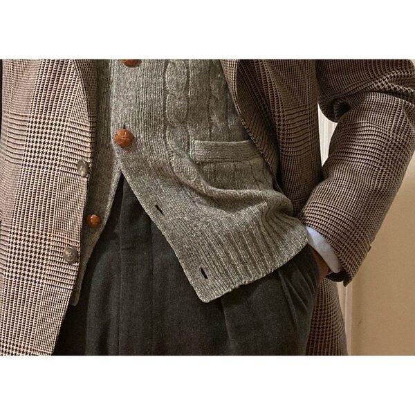
This is the kind of blue ensemble I can get behind, though the casualness of the jacket fabric does make it a trifle odd, since jacket and tie in the same color is generally a city look. Matching the tie ground to a secondary color in the shirt usually works well, as it does here. And the tie dots and hank colors keep it from being boringly monochrome. I would say that a lot of what Claghorn is doing when he dresses is taking suburban cuts and fabrics and citifying them with his color choices and color combinations.
 
Last edited:

Claghorn

Stylish Dinosaur
Dubiously Honored
Spamminator Moderator
Joined
Aug 21, 2012
Messages
12,899
Reaction score
31,941
Shirt is green on white.

---

Agreed about the oddity of the tie texture and scale of the checks. I went into it with eyes open and like the look, but agree that it has, well, an odd effect.

---
 A lot of what Claghorn is doing when he dresses is taking suburban cuts and fabrics and citifying them.
I rather like this, though I think it is more the reverse. Taking city like combinations and suburbanizing them (to use your lingo; I just think of it as taking city concepts and casualizing it).

---

In general, I only like blue on blue in suits (which this is).
 
Last edited:

Caustic Man

Stylish Dinosaur
Joined
Apr 17, 2012
Messages
10,575
Reaction score
10,456
Interesting concept (suburbanization v. citification). I've never lived in a true suburb before moving to the Chicagoland area. San Diego county is a series of small cities (and one large one) and Louisville doesn't have a true suburbs to my mind. All the other places I have lived have been overseas or in weird places like Jacksonville FL which have excessively large city areas land wise. What I'm getting at is that I have noticed a definite designation between city and suburb wear. Before this I would only have made a distinction between city and country (still very reasonable in places like Louisville). City and suburb, to my mind, is a different animal. I'm still not entirely sure on it, but it is fascinating.
 

Isolation

Distinguished Member
Joined
Nov 7, 2013
Messages
1,995
Reaction score
2,558


1000


More test drives of new ties: Hober black rough silk. Probably would have gone with white linen PS, but felt like it'd add a bit more chill to the whole look.

I have to say though I'm not super happy with the cut of the jacket. I think if I could, I would have the buttoning point lower and show more of the tie. I think the tailor had the button exactly at half-way point of the jacket, but because it's DB that makes it look a bit too high I think. Well I guess it's moot now, but might want to think about that for next time. I don't think I'll be commissioning any db jackets for a while though.

Also, the jacket sleeves look shorter than it is because I just put my FC shirt on and it's still a bit stuff and holding the sleeve up (it's same length as my other jackets, which is possibly a hair short, but not as much as it looks here).
 
Last edited:

Mr Engineer

Distinguished Member
Joined
Jul 29, 2012
Messages
1,060
Reaction score
618
Ready to rock the executive comitee.
PS is only for the pics in a kind of "what I would wear if it wasn't my first executive comitee at new job today" way.


@SYCSYC

Do you iron your own trousers. If so what is your technique?

Your trousers are sharp as a blade
icon_gu_b_slayer[1].gif
 
Last edited:

Testudo_Aubreii

Senior Member
Joined
Apr 29, 2011
Messages
947
Reaction score
309
Green check on white? That would explain why AAS thought cream ground. I wonder what a sky blue check would do to the nub-check scale matching. Somehow I think it'd harmonize better.

I think it's mainly fabric, cut, and pattern that decide whether a coat is city, suburban, or country. I'm using these categories as they were thought of in the 1930s. Smooth worsted is city, flannel is suburban, tweed is country. Peak lapel is city, notch is suburban or country. Pinstripes are city, checks are suburban or country. A worsted flannel in a light gray POW check is the paradigm of a suburban suit, although cream chalk stripe on a dark brown woolen flannel is a close second, and a seersucker in a navy bar stripe on an ivory ground is up there.. Hercule Poirot loved city clothes; from the 1930s on, the Duke of Windsor loathed them.
 

Coxsackie

Distinguished Member
Joined
Sep 30, 2013
Messages
4,148
Reaction score
11,513


Quite a decent fit, ruined by the photography. Burn that wide-angle lens with fire (or save it for landscape shots), and get a fast 50mm prime lens. Your world will change for the better.

1000


I have to say though I'm not super happy with the cut of the jacket. I think if I could, I would have the buttoning point lower and show more of the tie. I think the tailor had the button exactly at half-way point of the jacket, but because it's DB that makes it look a bit too high I think.

Yes, it's too high, and that fault is accentuated by the excessive (yeah I know, YMMV, we've been through all this before) waist suppression.

I think the jacket would be saved by letting out the sides a bit.
 

clarinetplayer

Distinguished Member
Joined
Mar 12, 2002
Messages
4,612
Reaction score
7,677
1000


Wednesday: The Brooks Bros tartan tie
 

PCK1

Distinguished Member
Joined
Jan 19, 2014
Messages
3,101
Reaction score
3,214


You had the right idea in your head this morning when you dressed. But, in practice this is a failure.

The orphan suit jacket is a failure. Both as an odd jacket...and more importantly in relation to how it fits you. It doesn't fit you. I think you should get rid of it. It's too short and an alteration on it won't help. I don't like the "french blue" shirt. To me this is a strictly business shirt. Not one I would wear with an odd jacket and trousers. And one in general that I would choose rarely. The tie and ps are ok. The best thing about your fit is your shoes which are a serious improvement over every other pair I have seen from you.

But I think most importantly your fits give off an unpleasant slovenliness. Perhaps it is the heavy wrinkling of your jacket and trousers which is worsened by the poor fit of the jacket. A well pressed jacket and sharply creased trousers would improve your overall appearance dramatically.
 

Braddock

Senior Member
Joined
May 1, 2012
Messages
606
Reaction score
8,277
@Braddock
Beautiful SC! What is the watch and is the band blue or black?

Thanks! It's a Omega Deville from late 80's and the band is black, but I changed it in the meantime to a dark brown.

@Braddock

The manbun preparation for your move to Japan?

Also, how long will you be living there? I know a few Japanese stores carry Shibumi, right?

Hehe yeah, kind of. I don't know so far, but as long as I want. I really love it here! No, unfortunately not, but hopefully in the future. :)
 
Last edited:

Dennis Walter

Senior Member
Joined
Jul 20, 2011
Messages
208
Reaction score
2,539
Nice and simple. Suit cut works well for you.
Really nice, just not a fan of the white stitching on the shoes.
Shirt and tie are both very warm in color and clash in my eyes. A light blue shirt or a colder brown tie would be much better, I think.
Really nice, one of my favorites of you so far.
Yes, shirt is much better! I know it's seen as a standard combination, but I'm not a fan of the "navy tie and navy suit" combo. The same tie in brown, burgundy, green would have been nice.

Thnx, @Sander .

Hmmm....your TASSEKS are nicer than my TASSEKS.

I might have to consider a TASSEKs upgrade.

You might, @Coxsackie . But then again: even gods fail sometimes...
icon_gu_b_slayer[1].gif


I'm always a fan of a nice blue and brown combination.


Thank you both. It's a tricky shirt for me – the wide collar and extremely smooth poplin steered me into thinking it would work in this context, but I think if I had looked at it from this point of view, I would have thought better of it.

I think the problem I'm running into is that everything I know about dressing in practice is basically country clothes, since I've dressed that way for years. Now that I'm trying to dress more formally – without taking things back to the absolute basics – I've lost my way a bit. It doesn't help that I've built a wardrobe focused on a slightly lower level of formality/urbanity than I'm starting to wear.

So I appreciate all the feedback. It's a slightly tricky process.

It is - it takes time to recalibrate one´s wardrobe and develop a different sense of taste. Take your time, we all will get there some day...

Some weeks ago in Macclesfield.


Not a fan of the bun, @Braddock - but then again you´re going to be a menswear Ninja / Samurai of sorts, so i guess this is justified. Lovely texture and fit on the jacket.


Never not loving the combination of blue and orange.Nice one, @Gerry Nelson .
Close. It's a wool/cashmere/silk blend. I like it a lot, even if the fabric is pretty robust it has a very soft touch. Wish it was 2 cm longer, otherwise very happy with it.

@DiplomaticTies , it is a lovely jacket for sure, would if i could add this to my closet as well.


Loving the tie, @Koala-T !


Generally speaking, i don´t like plaid ties so much, but this one works very well with the suit, @Mr. Six .
 

Featured Sponsor

How important is full vs half canvas to you for heavier sport jackets?

  • Definitely full canvas only

    Votes: 91 37.9%
  • Half canvas is fine

    Votes: 89 37.1%
  • Really don't care

    Votes: 25 10.4%
  • Depends on fabric

    Votes: 39 16.3%
  • Depends on price

    Votes: 37 15.4%

Forum statistics

Threads
506,797
Messages
10,591,953
Members
224,313
Latest member
wesbarts
Top